Such A Great Book
It was such a natural progression to remain with Brenda Watson and RENEW LIFE after designing and paging her NYTIMES Best Seller, The Fiber 35 Diet. I was eager to jump right into my role as creative director, designer, and photographer on Heart of Perfect Health (HPH). Little did we know this endeavor would be a behemoth to pull together, but all completely worth it. HPH has many working parts from the granular science of health, to astonishing 3D illustrations, to in-depth interviews, to a manageable diet, to an easy how-to cookbook. Making all this information “sing,” visually speaking, as well as function in regards to information delivery was a super fun challenge.
The project took the entire team about 9 months. This included tons of market research, countless hours of writing and fact-checking, recipe development, food photography, and loads of design. I was fortunate that Brenda and RENEWLIFE trusted me to add in and conduct a thorough focus group comprised of trusted health science faculty, executive chefs, nutritionists, hardcore cookbook consumers, and restauranteurs. The results speak for themselves.
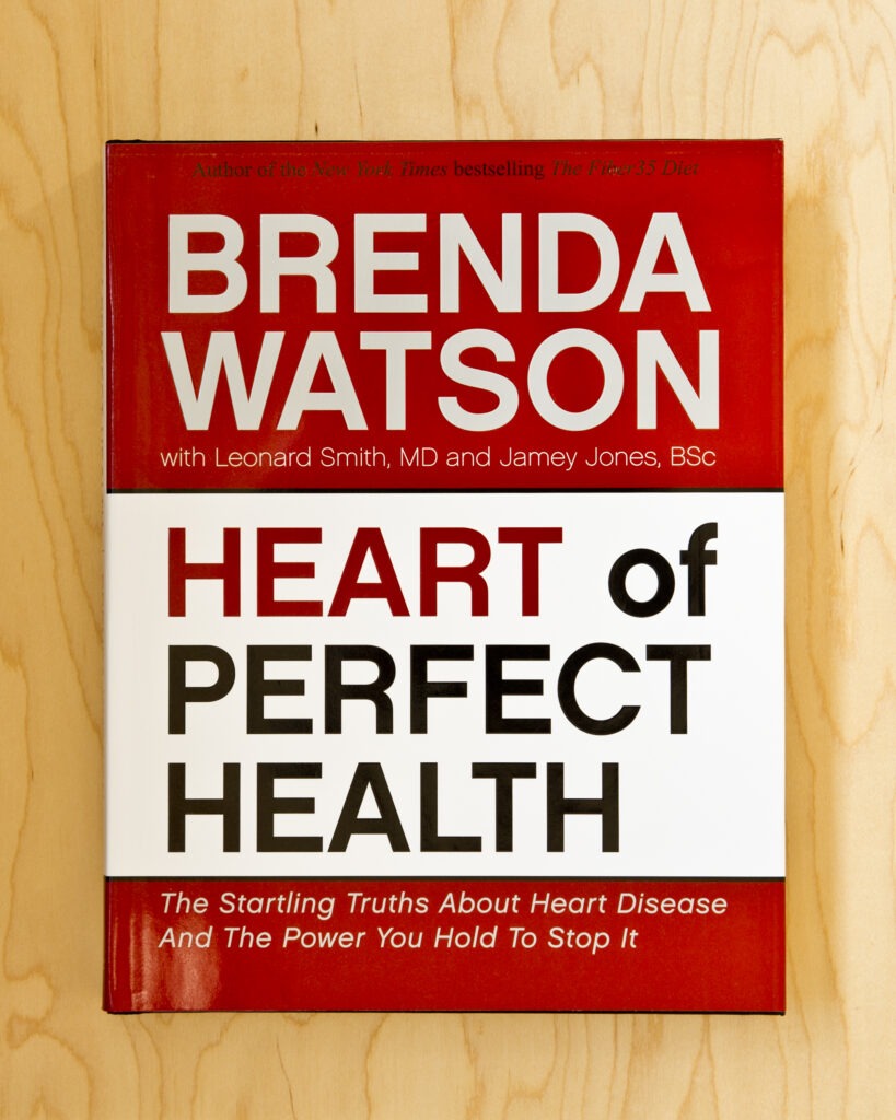
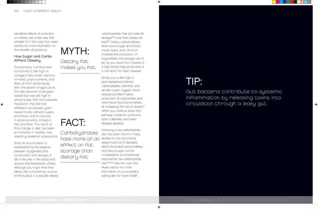
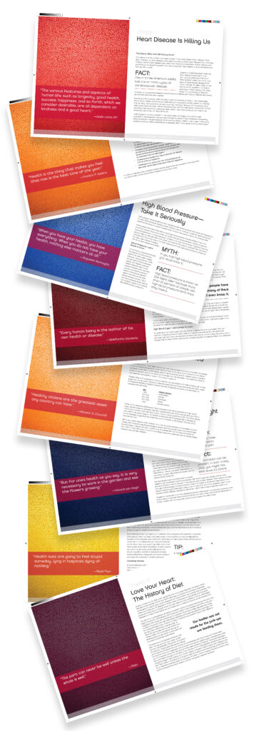
The overall design was intentially easy to read, especially for those will poor vision, playful in that most pages had a dynamics to engage the reader, and interesting content both visually and substantively. Here are a few basic page styles.
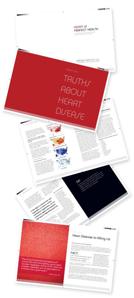
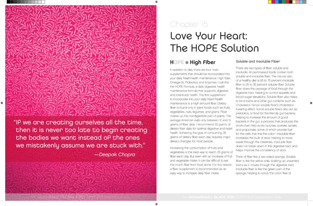
I led every chapter with an inspiration quote from well-known sources. If your curious about the graphic, I created this from photographing handmade goldleaf wallpaper in Ann Arbor, Michigan. I fell in love with the delicate line structure and organic pattern. I also used the graphic as a nice treatment on the front and back liner. Here are a few of the chapter intros.
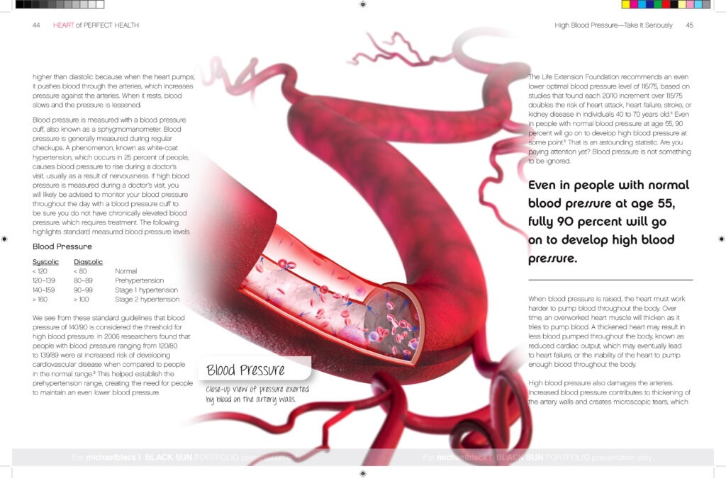
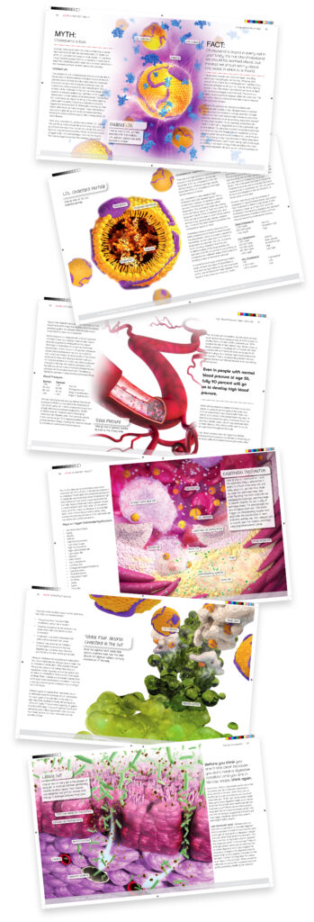
One can not overlook the stunning illustrations by Adam Questell. In his own right, Adam is one of the finest and most accurate medical illustrators. After a lenghty international search of remarkable talent, we were very fortunate to have him join our team. Each illustration was created from design direction and complete understanding of the material. Here are a few illustrations.
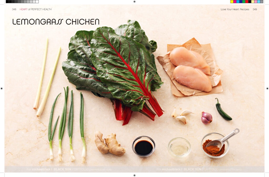
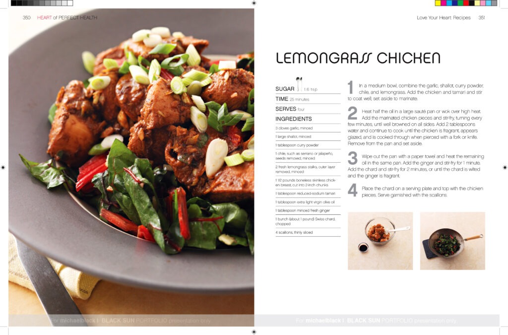
Please don’t count out the photography. This was serious fun. What’s really cool about working with high performing clients for a considerable amount of time is the trust you build with them. When I revealed my concept of showing ingredients as the hero trailed on the following pages by the finished recipe image and the cooking steps, Brenda and the team loved it and gave a green light to move forward. My intent was make cooking easy not scary. This approach proved to be incedibly popular with our readers and other designers. Here are a few spreads from the cookbook section.

It would be nice to include the enite book in pdf form. Until that is possible, I would be happy to have you come by the studio and spend as much time as you would like with our copy.
